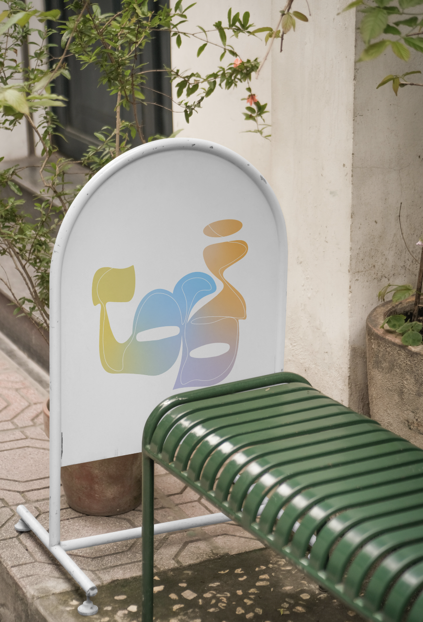
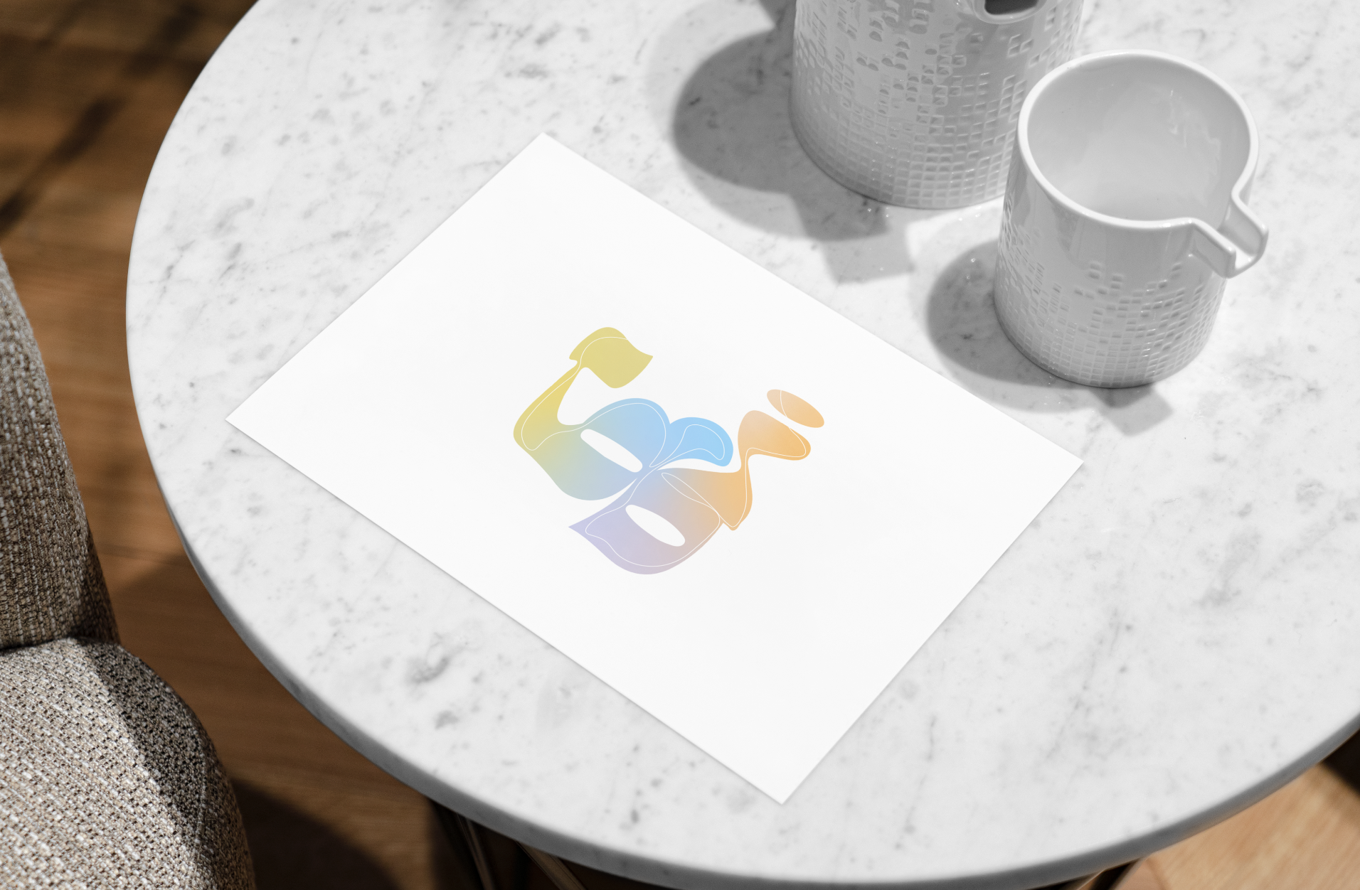
Tobi Rebrand
My creative strategy is to visually redefine Tobi Ponsonby as a futuristic, innovative brand that seamlessly bridges tradition and modernity, appealing to a progressive, style-savvy audience. I have used colour to form an identity which is clean, having gradients and layers of colours throughout. I have formed a custom typestyle to an image using unique shapes and flows with sleek and subtle but abstract traditional elements. Composition across all logo prototypes have emphasized sophistication and evolution, embodying a futuristic aesthetic that resonates with Tobi’s chic, modern target market.